
Earlier in one of our blogs we talked about the features that help customers manage their money through their digital banking mobile applications and web. We discussed the features that allow them to handle their money, make easy payments, monitor their spending, plan their budget and protect themselves in case of fraudulent acts.
In this article, using data from the  digital banking research platform, we will be showing you the US banks that offer the best user journeys for these features. Namely, we will present the most UX-friendly user journeys for Blocking/Unblocking a card, creating Saving Goals, Tracking their Spending and Setting a budget. We will be showcasing the best user journeys for these categories for the web and iOS channels.
Block/Unblock
It is quite common for customers to find a suspicious transaction in their accounts that they might have not authorized. But customers need to be able to protect themselves. That’s why being able to block the card is an extremely important feature to be provided by a digital banking provider for customers. At the same time customers need to be able to unblock that card when it’s safe to be used again. Chime and Current provide seamless user journeys for blocking and unblocking cards in the web and iOS channel respectively.
For the web channel Chime takes the crown for both these categories. It takes 8 steps* to block and unblock and the UX is evaluated at 940 out of 1000 according to our Perfect 1000 scoring system. Users need to log in, head to ‘Settings’, omit some information and then turn the debit card transactions off or on.
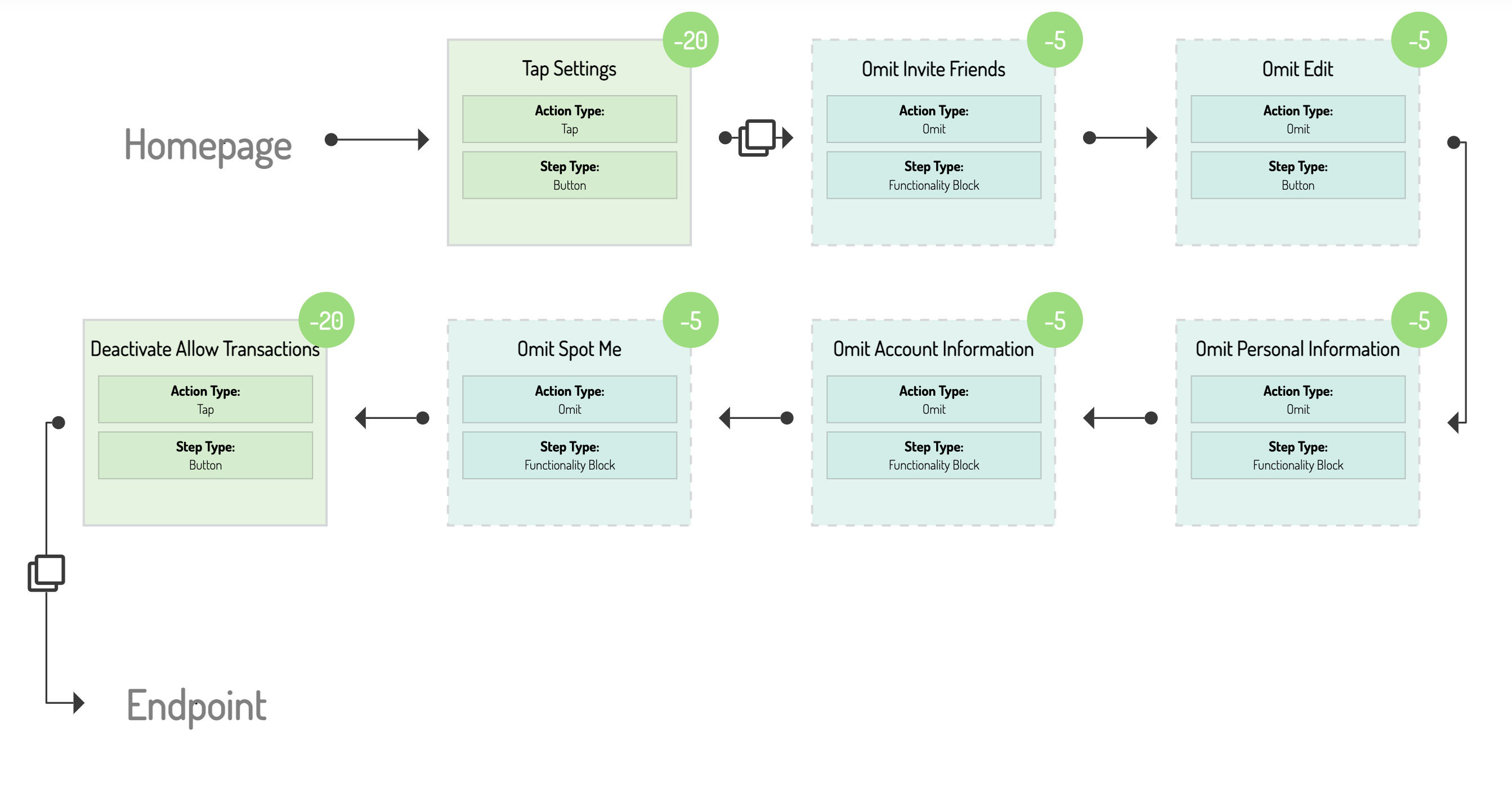
Through the iOS app, Current customers can block and unblock their cards swiftly in only 7 steps. The user journey amasses an excellent UX score for both, 945. By logging into their account, from their home screen they have to navigate over to their ‘Card Settings’ and simply activate or deactivate the card to block and unblock it.
The user journeys for both channels presented are quick, convenient and easy for customers to follow so that they can block or unblock their cards in seconds. Simplicity is key here especially during a situation which can be anxiety-inducing.
*Steps can be active and passive. Examples of active steps include tapping, typing, swiping, while passive steps are reading, omitting information etc.
Saving Goals
Another feature that makes money management easier for customers is being able to Save money. Specifically to create a Saving Goal through their digital banking provider that will allow them to raise an amount inside a specific time frame. The banks that platform illustrated to incorporate the best user journeys for this are Bank of America for the web channel and Chase for iOS.

In Bank of America this scenario is completed after following 29 distinct steps through the web channel and the UX is evaluated at 546. After logging in customers need to head over to ‘Tools & Investing’, select ‘Budget’ and Goals and begin creating one. They can select between three types of Goals, for a rainy day, a trip or maybe for an expensive purchase. Then they select the amount for that goal and the date to start and complete saving. Finally, they have to select the account where the money for a specific goal will be saved, the amount and frequency of payments toward the goal, review and start the goal.
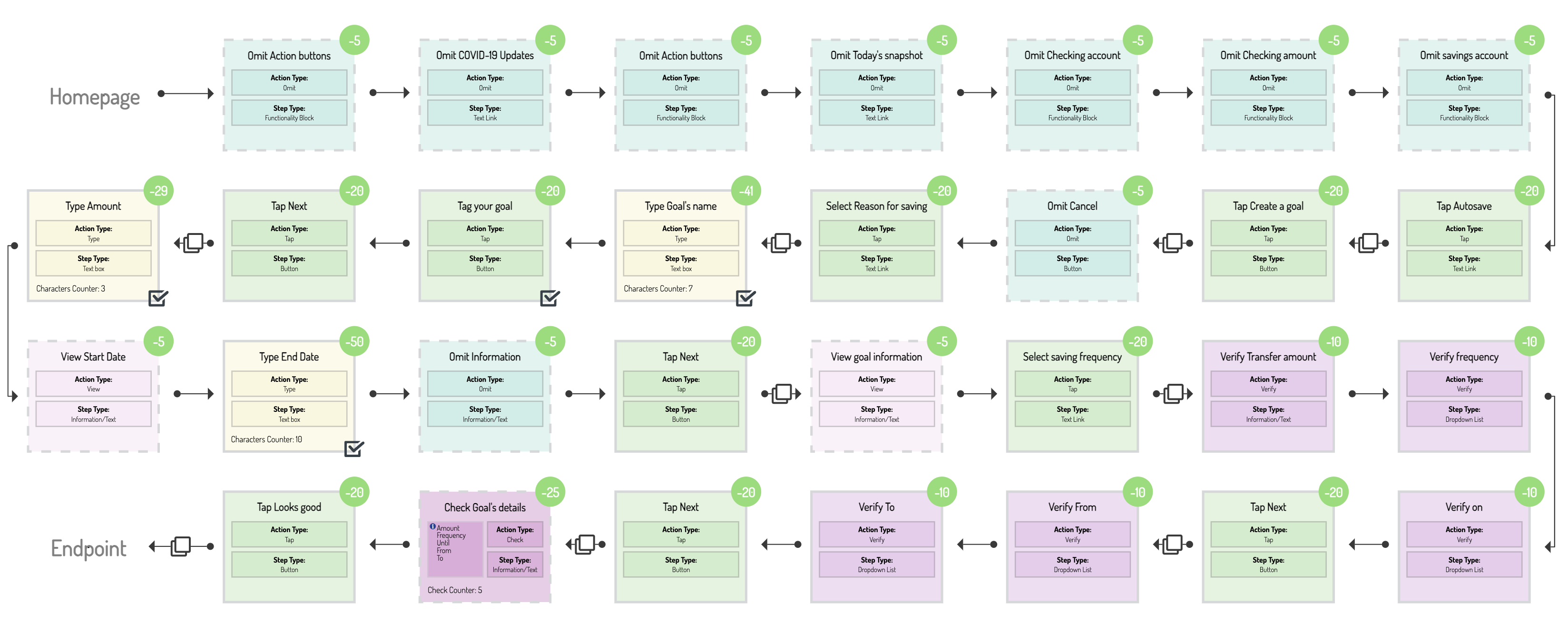
For the iOS channel the same process is best completed by Chase bank in 32 steps with a UX score of 550. Customers need to omit several information before they can tap ‘Autosave’ and start the process. There they will have to select to create a goal and like Bank Of America decide between different types of goals (e.g., ‘Custom Savings’, ‘Safety Net’). Then they have to type a name for the goal and tag it to a broad category (like ‘Car’, ‘Travel’), set the target amount, select start and end date of the goal and the frequency of recurring payments. Lastly, they have to select the account where the money will be transferred to (the account where the money will be saved) and the account from which the transfers will be made, review and start.
While the processes seem very intuitive and helpful to customers that need to save for different goals, it seems that is room for improvement. For example, in Bank of America customers might be restricted when they have to select between specific and not open to decide goal categories. On the other hand, Chase customers need to omit several information before they actually can begin the process of saving a goal.
Track Spending
We couldn’t talk about customers easily managing their money without including a feature that helps them track how much money they spend and where and plan accordingly for the future. Two banks have been found to offer that feature most conveniently for customers, Chime for the web and Huntington Bank for the iOS channel.
Chime allows users to have a very clear and subtle way of seeing all transactions of a specific category. Customers can select the desired category from the corresponding dropdown menu located above the transaction filters. By clicking it and selecting categories, the Chime application filters and shows only that selected ones to customers. This way the user journey is completed in just 7 steps and gains a UX score of 930.
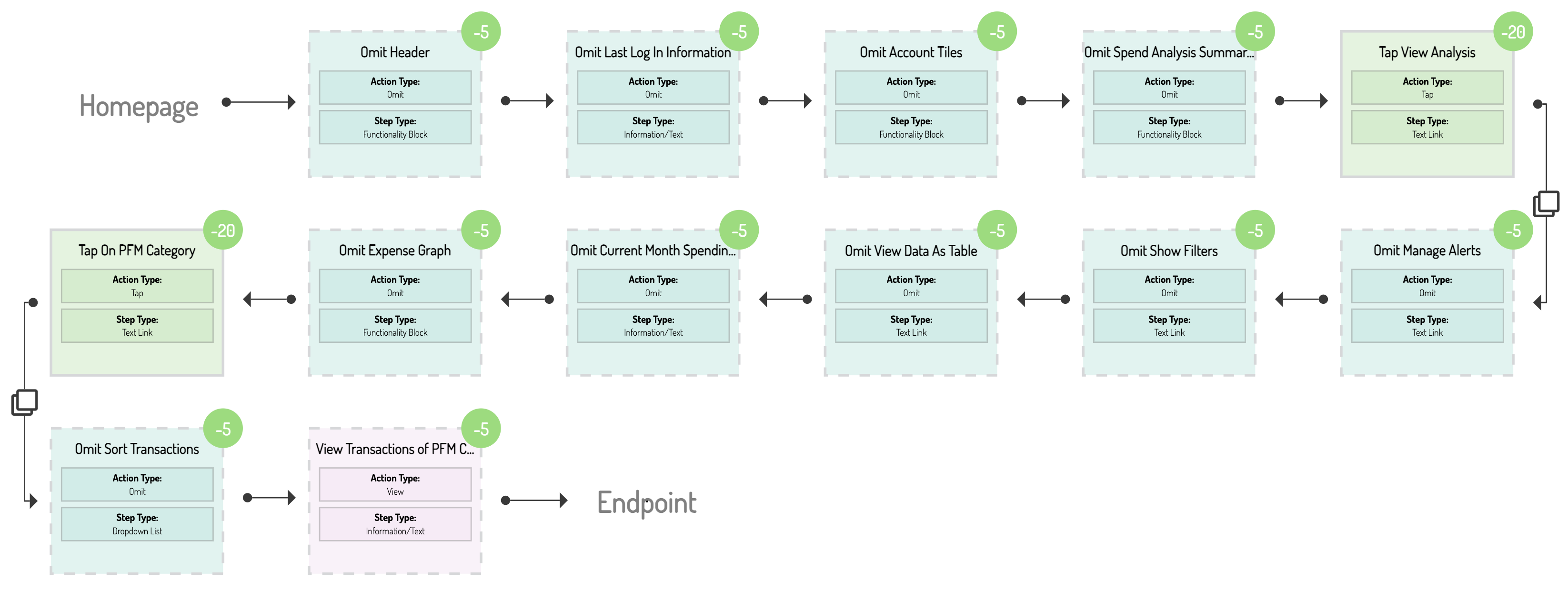
Huntington bank offers the same journey in the iOS app with 15 steps and a UX score of 905. While the customer has to omit several information during the user journey, they only have to navigate from the hub to ‘Spend Analysis’, view third overall spending and then dig into specific categories.
In both channels the users can in a few steps and with relative ease first have an overview of their spending and then manage it better.
Set a Budget
Finally, an undeniably helpful feature that digital banking providers offer is the ability for customers to set a budget they want to spend, therefore avoiding overspending. This feature is best offered on the web by Wells Fargo and in the iOS channel by People’s United Financial.
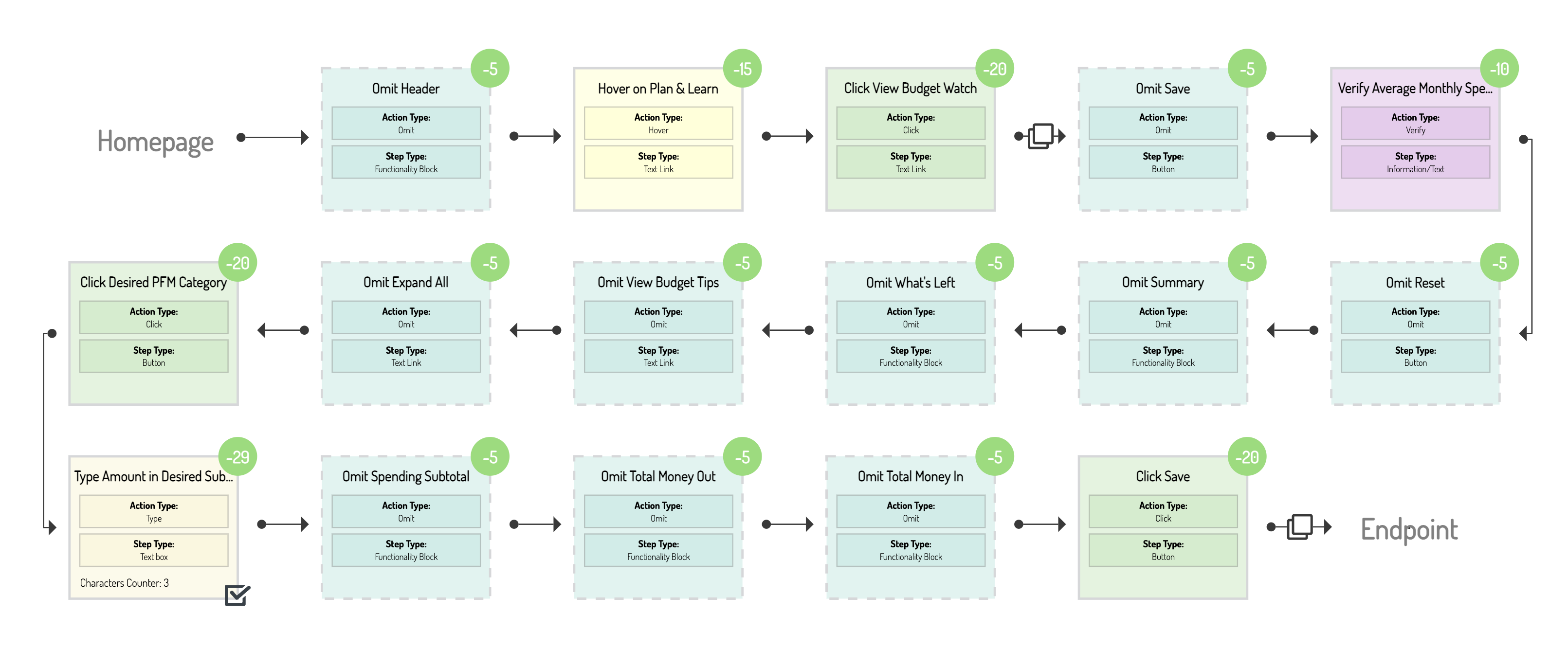
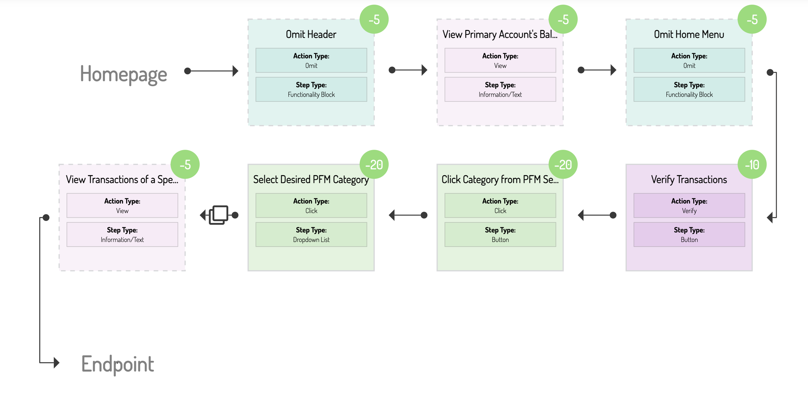
This specific user journey in Wells Fargo requires customers to follow 18 steps to complete with a UX score of 863. After hovering over ‘Plan & Learning’, customers will have to click on ‘View Budget Watch’. Then they have to select the appropriate Personal Finance Management (PFM) category and then click on the desired subcategory’s text field to type the budget. By clicking on the ‘Save’ button at the far end of the budgeting categories list the budget is active and running.
The same user journey in the iOS app of People’s United takes 11 steps and aggregates a score of 841 in its UX evaluation. People’s United customers can easily tap on the ‘Personal finance’ button and from there to ‘Menu’ to reveal the ‘Budgets’ option to set a monthly budget. Then, they can choose to add a budget for a specific category, type the desired amount and complete the process.
The process is similar for both banks in their respective channels. Smooth, fast and with the customer in mind as it is very convenient to set up a budget for a specific category.
The importance of these features to customers have been amply showcased in our previous article. But, simplicity and convenience is also necessary for an offering to successfully cater a customer's needs. As shown above both High Street banks and Challengers have understood the importance of catering these customer needs in the most efficient way. Other banks should be taking a closer look at how they offer or even if they offer such features at all.
Customers will be highly motivated to make banking providers their primary bank that both provide the majority of these journeys and at a great quality. The data is there to show that there are banking providers that offer those in a very convenient way. So it is misstep for banks to look the other way and not factor in competitors even if they are not directly catering their specific market. PFM is the Alpha and Omega for personal banking. Lack of effort to include or optimize such features might in the future result in banks losing customers who will be migrating to their competitors.
Take a look at today and examine thousands of user journeys, including the best UX-practices worldwide that will supercharge tour digital banking.